Monthly Archives: December 2016

On How the Digital Sausage is Made

From the outside, Silicon Valley looks like a gleaming tower of technological perfection. Yet, once the curtain is pulled back, we see that behind that shimmering façade is a warehouse of good old fashioned humans, subject to all the same biases and fallibility, but with their results now laundered through the sheen of computerized infallibility.

— Kalev Leetaru (in an otherwise droll article on Forbes)
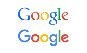
On Google’s 2015 Logo

Two-up Google logos, before and after the 2015 rebrand. The first is a well-shaped serif font and the second is a geometric, single-stroke-weight sans-serif.

The new logo retains the rainbow of colors but sheds the grownup curlicues: it now evokes children’s refrigerator magnets, McDonald’s French fries, Comic Sans. Google took something we trusted and filed off its dignity. Now, in its place, we have an insipid “G,” an owl-eyed “oo,” a schoolroom “g,” a ho-hum “l,” and a demented, showboating “e.”

— Sarah Sarson in the New Yorker (archive)