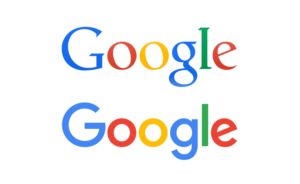
The new logo retains the rainbow of colors but sheds the grownup curlicues: it now evokes children’s refrigerator magnets, McDonald’s French fries, Comic Sans. Google took something we trusted and filed off its dignity. Now, in its place, we have an insipid “G,” an owl-eyed “oo,” a schoolroom “g,” a ho-hum “l,” and a demented, showboating “e.”
— Sarah Sarson in the New Yorker (archive)
